Talks
Porto dataviz Workshop - A great 2 days Data Visualization Workshop with a keynote by Alberto Cairo.
Hackaviz 2020 - The third edition of our annual dataviz contests, organized with Toulouse-dataviz.
How to Lie with Graphics - A serie of seminars @MIAT (Toulouse), @ENS (Lyon) & SMART-LERECO (Rennes)
Comment mentir avec des graphiques - Octobre
(Fęte de la Science, Caussade)
How to Lie with Graphics - March (Bordeaux)
The Vistorian & the Bertifier : Online Tools for Visualizing networks and tables - January
Books and Ressources In Dataviz
- July
Dataviz for Data Scientists -
January 2018
Shiny is good for you! -
November 2017
Everybody's got to cheat sometimes
- October 2017
Never use Radar plots!
- March 2017
Meetup Data Visualization- February 2017
Dataviz
course Msc Big Data - December 2016
Meetup Data Visualization- March 2016
ENSAI dataviz course - Feb. 2016
TSE Workshop- March. 2015
Cafe de l'IMT - Jan. 2015
Rencontres Ingé-stat - May 2014
Rencontres Ingé-stat -November 2013
Nice websites
Best of all: Toulouse Dataviz Association
But also:
Yan Holtz FromDataToViz
Nathan's Yau Flowing
Data
Stephen Few has many
examples
Michael Friendly Dataviz
Website
Alberto Cairo
Website
Tamara Munzner
Website and book
David Taylor nice Youtube video
Gaetan Gaborit SlideShare
Improving
data visualisation
Data Driven Documents (D3.js)
Cité de
l'économie et de la Monnaie
and of course, the most hilarious one:
http://viz.wtf/
Others
Porto Data Visualization Workshop
December 2020 (Organized with BPLIM and Banco de Portugal))
I co-organized this 2 days workshop and had the chance to convince
Alberto Cairo (University of Miami, Data Journalist, author) ,
Yan Hotlz (Datadog, Creator of From Data To Viz), Chiara
Sotis (LSE, researcher) and Christophe Hurter (ENAC,
Researcher, Storyteller and author) to present and discuss their work.
Thanks to Edith Maulandi and his team, we also organized a
nice training for some registered participants.
The videos of this event are online. See
the
program, slides and presentations (videos) below.
Keynote:Alberto CAIRO(University of Miami) |
"How to Make decisions in Data Visualization" |
 |
| Christophe BONTEMPS |
"How to Lie With Graphics" (English long version) Slides |
 |
Workshop:Yan HOLTZ(DataDog) |
"From Data to Visualization" GitHub |
 |
| Christophe HURTER (ENAC) |
"Data-Driven Storytelling and data emerging presentation
technologies" Slides |
 |
| Chiara SOTIS (LSE) |
"The scale of COVID 19 graphs affects understanding,
attitudes, and policy preferences " paper |
 |
#hackaviz2020
March 2020 (Organized with Toulouse-Dataviz)
The third edition of our annual Data Visualization context has been
a real success, despite the covid-19. We decided to maintain the
contest, and 37 contributions were submitted. You'll find here all the dataviz. The event (as well as the
jury) was online only and we celebrated the winner in a live Twitch
broadcast gathering more than 100 viewers and recorded.

How to Lie with Graphics
October 2019-Feb 2020 ( MIAT Toulouse; ENS Lyon & SMART-LERECO, Rennes)
A new (improved?) version on this really hot topic, still with 10+
rules for lying and a little bit more of structure in the presentation.
I was really happy to learn even more on truncated and double axes for
these seminars. Thank you all for the invitation and for the great
audience. The slides of my MIAT presentation are available here,those
for my ENS-Lyon seminar are there,and those for my
seminar at SMART-LERECO
(INRAE, Rennes) are there

Comment Mentir avec des Graphiques ? Les
dessous de nos médias
(Octobre 2019, Fęte de la Science , Caussade & Meetup Toulouse DataViz décembre)
L'université Populaire de Caussade (82) m'a gentiment invité ŕ participer ŕ la fęte de la science pour parler de ce sujet dans leurs mahgnifiques locaux. Une occasion de montrer quleques rčgles de visulaisation pour "tricher" avec les représentations et de les illustrer avec des exemples tirés de journaux, TV et bien-sűr de la maison blanche.J'ai récidivé et n'ai pu m'empęcher de faire un  sur ce męme sujet en décembre. Le sujet interesse vraiment. Les slides
sont disponibles ici. et j'ai pu également enregistrer et monter
la présentation en vidéo (sur Viméo).
sur ce męme sujet en décembre. Le sujet interesse vraiment. Les slides
sont disponibles ici. et j'ai pu également enregistrer et monter
la présentation en vidéo (sur Viméo).
sur ce męme sujet en décembre. Le sujet interesse vraiment. Les slides
sont disponibles ici. et j'ai pu également enregistrer et monter
la présentation en vidéo (sur Viméo). 

How to Lie with Graphics
(March 2019, Bordeaux)
I was invited to join Nicolas Rougier (INRIA) at the Bordeaux University (Urfist) to talk to PhD students and researchers on a rather "hot" topic: " To Cheat or not to Cheat : The Dark side of Science". For the occasion, I have written a presentation showing "How
to lie with graphics". Do not reproduce at home...
See the
slides, the great Sketchnote of my talk done by the amazing Edith Maulandi, and the video (in English) below:
 |
 |
The Vistorian and the Bertifier: Two online tools for visualizing Networks and Tables
(January 2019)
I recently discovered with great joy these two online tools created within the AVIZ dataviz research team (INRIA). Benjamin Bach, introduced the Vistorian he created (ans maintains) during an online workshop and I just loved the tool (and the guy). So here is my attempt to disseminate these two tools during a
session: The slides and the video (in French) are online. 
Books and Resources in Data Visualization
(July 2018)
A personal selection of books, online courses, blogs and website for this summer. My presentation in the
organized in 3 lightning
talks can be downloaded
here. Data Visualization for Data Scientists
(January 2018)
A great audience (a full big room) for this lively
session organized jointly with Toulouse data science. My academic point
of view on what is data visualization, how to use it, how to do it,
based on early statistical literature and my own teaching and research
experience. The slides of my presentation as well as a video of my
presentation (in french) are full of examples and references.
Shiny is good for you !
(November 2017)
The R package shiny is one of the coolest package in R. In this presentation, I show how to create a first interactive application even without any advanced R programming skills. The slides of my presentation will show you how, as well as the live-coding video (available soon, in french).
Everybody's got to cheat sometimes...
(October 2017)
This month, I have written two new blog posts on the virtues of cheating with data. Yes! Cheating! Well, this is no fraud, nor really "cheating" as you will see. The first one shows that even well known data visualisation were constructed using some distortions in the data. In the second, I explain why I had to cheat to see into darkness in my own research project.A video has been recorded during a cool
session. You can enjoy my talk (25mn, in French) by clicking on the
image, or simply enjoy the
slides (in English).
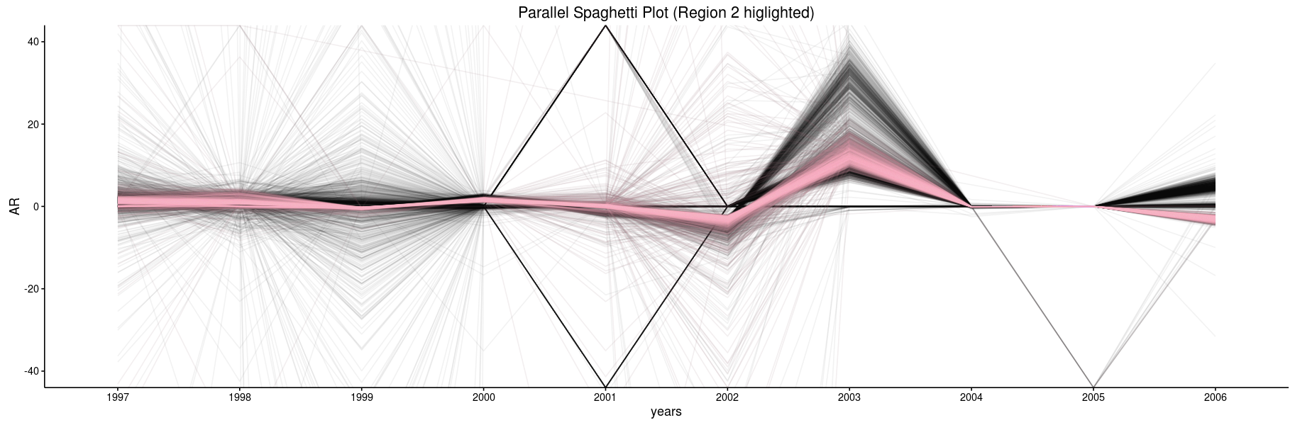
Why you should never use Radar Plots!
(March 2017)
My new blog post should convince readers that radar plots are source of huge distortions in the representation of the underlying data. We show, using a numerical example, how axis ordering and area representation may change the representation, and thus the perception of the data set.
")
")
A video has been recorded during a new
session in April, 2017. You can enjoy my talk (20mn, in French) by
clicking on the image, or simply enjoy the slides (in English).

Comments are of course welcome!
Meetup Data Visualization : Maps and Networks: Why and How to visualize?
(February 2017)
A nice and lively
talk with more than 40 people attending. Great discussions and
feedback on my controversial presentation.

You can (re)view the slides of the talk, or (re)listen to the video of the complete talk. (in French, 100mn). The slides are in English. Comments are of course welcome!
Meetup Data Visualization 2016
(March 2016)
My first experience, with a friendly
community.
 |
|
|
You can enjoy the slides of this presentation " Data Visualisation for Data Science: Principles in Action", You can also play with my new interactive pedagogical application. (Done with R package shiny). You may like (or not) a short video (shot with an iphone) describing that R-Shiny application ( in French). |
|
ENSAI 2016
(February 2016)
| All the slides form the lectures given during the course for
the students at the ENSAI Big Data Master are available to students
upon request. All the R codes used during this course (shiny, googlVis, ..) are in this archive. The data are in an other archive. They should be unzipped in separate folder. You can also play with my Shiny application on nonparametric regression on the shinyApps platform. I have also created a file full of references many of them have been used during that course. It is based on the corresponding .bib file (BibTex) |
 |
Toulouse School of Economics Workshop (Food Economics)
(March 2015)
You may enjoy this 1 hour video (in French) recorded during my seminar at TSE. The slides are available here.
Café de l'Institut Mathématique de Toulouse (IMT)
(January 2015)
 |
My first public lecture (in French) on the topic, for a one hour tour of the history of data visualisation, under the title "Voir ou ne pas voir: La visualisation des données hier et aujourd’hui". The slides and are available on the website of the café de l'IMT. |
Copyright issues
You may freely use, programs and material for your own teaching or training( (please cite!). Please notify me if you are willing to distribute slides to people I haven't met.
Cool Website of the month
UK trade with the rest of the world, imports and exports, 1999 to 2015
Past Websites of the month
Meanders of the Mississippi river. Beautiful maps drawn by US Army engineers in 1944.

January- 2017